
Mobile Property Web Design
Handheld & tablet sites for the property industry
What is the one item that you use continually throughout the day? And what is the one thing that if you forgot at home would be like forgetting to wear your pants? Well, for those of you who said your phone, congratulations, you are spot on. For many people using their Smartphones is the first thing they do after waking up in the morning, for others, it's the last thing they check before hitting the sack. So, now that we got that out of the way, let's talk business.
How Mobile is Your Website Anyway?
Mobile traffic has exploded during the past few years, the reason being is that everyone seems to be online via their Smartphones these days. And the proof of that is, every estate agent website has seen more mobile visits and people accessing the web through their Smartphones, iPhones, tablets, and other handheld devices, than those accessing websites from their PC. As mobile traffic continues to grow, it has becomes increasingly clear that websites and property websites, in particular need to offer usability for their mobile visitors. This is where mobile website design comes in.
We all know what's it like to browse a website via our Smartphones, and the websites that were clearly not optimized for mobile devices are the ones we would mostly like to forget. And who wouldn't, full layouts don't translate well, and the browsing is more often than not, slow and painful. But your property websites doesn't have to be that way, because hiring mobile web design services can get you a website that can work on all platforms.
Why Responsive Mobile and Tablet Property Web Design?
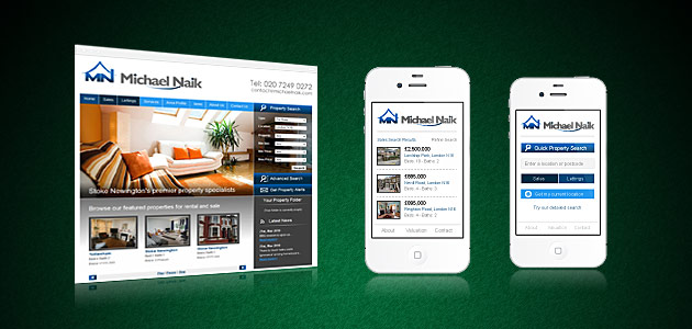
Responsive mobile website design for estate agents is a key selling tool that helps convert more customers and keep them up to date on your latest sales developments. Big Web Company create seamless Android, Windows Mobile and Apple estate agent web design user experiences that transition perfectly from their desktop equivalents. Easy navigation, Geo-location searches, fast loading, clear text and images are just some of the many benefits a responsive mobile website design for the property industry can have.
Don't lose potential tenants because your site doesn't work on a hand held device, get in touch with us and go mobile today.
The Benefits of a mobile property website
- Convert more customers. Recent research has shown that over 30% of people use their mobiles or tablets to browse the web and make contact and this is on the increase. Providing a fast and ideal user experience to increase conversions is the key goal of mobile website compatibility and is something every serious web business needs to take seriously.
- Search engines love mobile. Search engines like Google are now factoring in the mobile user experience when ranking sites. Being mobile friendly is vital if you rely on search traffic and want to make sure you have at the very least ticked every box.
At some point, it is estimated that mobile phones will overtake desktop PC's in being the most preferred way of browsing the internet, so by failing to get responsive web design and mobile sites, all you are doing is alienating yourself and your business from the majority of searchers who use their mobile phones to browse the internet. Not a nice thought now is it?
Don't get left behind during the fast growing mobile revolution
Whether we develop your website from scratch and include a mobile site by default or you have an existing website you would like converted to become mobile compliant, we can help. Give us a call and we will be happy to discuss the possibilities with you.
- Perfect for:
- Apple
- Android
- Windows
Does your current website work perfectly on your phone?
Now, here's the important question, does your website work well on your phone? If you're answer is yes, perfect, you are certainly ahead of the game. If you're answer is no, then you might have already figured out what needs to be done asap.
For any online business, the best possible thing these days is having a website that works on all platforms. This not only provides a positive experience for potential visitors, but also helps you reach out to more customers at the same time.
Branded, easy to use, mobile sales & lettings websites
With more people using mobile devices to connect with you online, now more than ever is it important to give customers that seamless transition they can conveniently and easily use while on the move. A mobile centric version of your site is designed specifically for changes in screen size between devices and ease of use.
- Mobile website design that adapts to different screen sizes such as desktop to iPad.
- Keeping your site easy to read we simplify the design, use bigger icons and text.
- Remove less important pages and Emphasise the key features of your main site.
- Streamlined user interface with less clicks for faster navigation and enquiries.
- Shrink and optimise images to speed up page loading times.
- Automatically switches to the optimal version when a mobile browser is detected.

